The Great White Way and graphic design have had a long, storied love affair, from the simple lines of a Hirschfeld caricature to the show-selling broadsheets, cab toppers and streetlamp pennants that seem to grab the man on the street by his sharp lapels and plunk him in an orchestra seat for a 7:30 curtain. This rundown of the posters of the 2015 season features many throwbacks keeping the tradition alive --- and just as many that are beating it half to death.
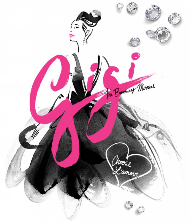 Well done! The revival of the Lerner and Loewe classic, the story of a poor student turned courtesan based on the novella by Colette, is giving us a timeless water color. The designer was smart, dabbing out a figure that looks torn from the drafting board of Edith Head. I could do without the diamonds on the upper right, but that's the minimalist in me.
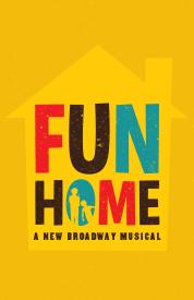 Coming to Broadway after a critically-lauded run at the Public, this musical adaptation of Alison Bechdel's graphic memoir is just the right tip of the hat to its source without being too much. The font is pure Bechdel and the silhouette of mother-daughter in the 'O' give the audience a glimpse of the tenderly off-kilter intimacy that lies in store for them.
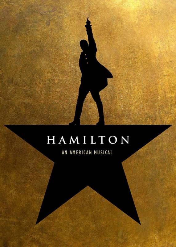 As the poet Andy Samberg once said: "You can call us Aaron Burr the way we're dropping Hamiltons." Another pull from the Public, Pulitzer-winner Lin-Manuel Miranda's musical treatment of America's first Secretary of the Treasury hasn't even finished its run there and is already slated for Broadway boards this summer. Pressed gold (cuz money) is the order of the day with Al's shadow as the topmost point of our star. This works for the show's star himself -- his is one on a precipitous rise -- but it works well for the subject too. Hamilton may have had a big ego, but what the hell were we all doing at 19? He was Washington's aide de camp and designing the American banking system. *mic drop*
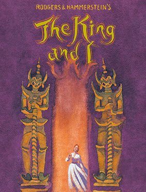 Okay. So I see what you're trying to do here. Respect. It's redolent of fin de siecle theatre posters or something with Sarah Bernhardt in it. It successfully calls to mind the time frame when Anna Leonowens made her famous trip to the Far East. But why is my mind's eye thinking more "Towering Inferno" than childcare and ballroom dancing? That doorway (pagoda?) opened up behind our hero looks like a pillar of fire sent down by a wrathful and jealous Old Testament God. More Lot's wife than Queen of Siam. Plus there's those scimitar-wielding demons staring her down. It was nice getting to know you, Anna, but I've got a sneaking suspicion our introductions -- and maybe your life -- will be cut tragically short.
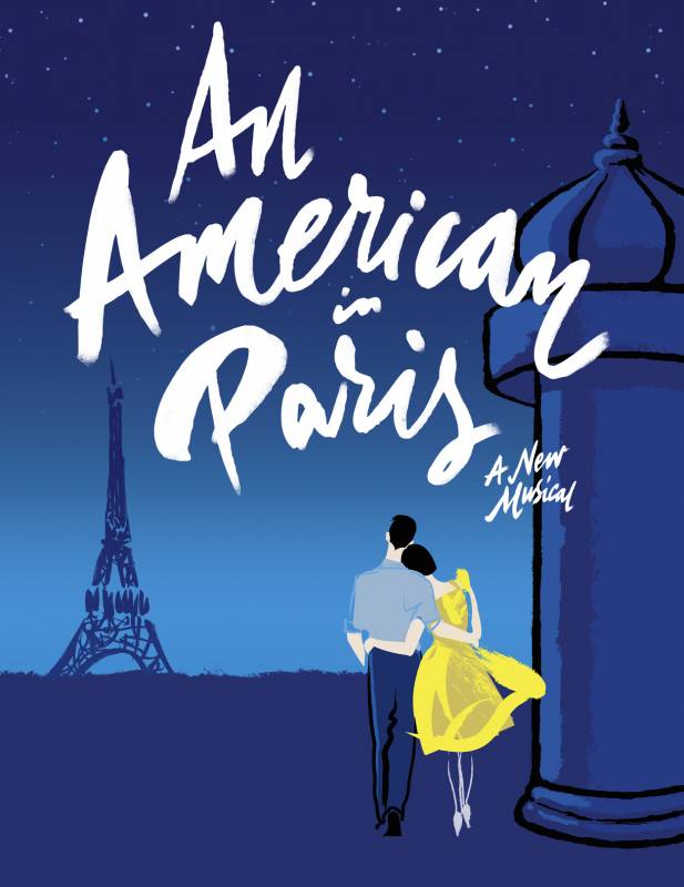 So I've never studied color theory. I don't have a major in design or anything even approaching it. I may be way off base here, but how many shades of blue can we cram into this unbalanced composition? And does pallid white and yellow really make it better? Is that girl wearing blue stockings or does she have weird ghost legs? I mean, her arms are solid white, so. This stage reworking of the Gene Kelly classic promises a lot of hoofing and is probably a balletic feast for the eyes. But my God, my eyeballs haven't been this distressed since exactly a week ago when they were rapt by a WHITE and GOLD dress.
 A poster for a play should briefly communicate something of the plot, theme or setting. I had no clue Wendy Wasserstein wrote a Pulitzer Prize-Winning play about that time modern Peggy from Mad Men, cardigan-clad Jim from American Pie and some guy I don't recognize all hung out together in a featureless white room. Thank you, Poster Person for giving me, the Person You Should Be Selling Tickets To, no more insight than what might be in these guys' wardrobe. And while we're on the topic of wardrobe...
Look you upon this picture...
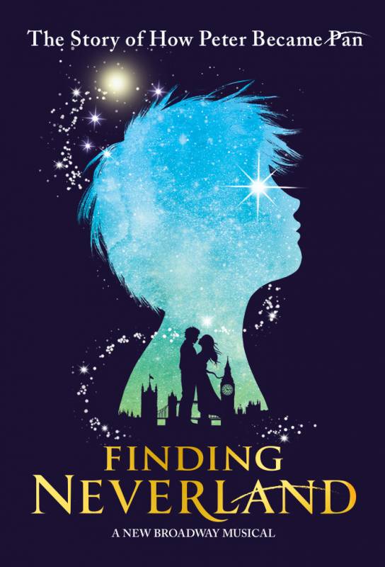 Now that's some great design. We've got London. We have lovers embracing. We have our immortal boyish subject and just a pinch of pixie dust. Great.
Look you now what follows:
 A promotional picture of radio doc Frasier Crane, Matthew Morrison (the dude from Glee) and Laura Michelle Kelly from a casting announcement. Now imagine the flying powder from the first image drifts to the right, swirls around this picture, add a dash of color correction and plant it on the 53rd and Lex 6 train stop and...
 WHAT ARE YOU DOING OUT OF COSTUME? Sorry. Pet peeve. Is it just me? Oh, it is. Sorry. I'll leave now.